
Rotary Knob
Introduction
Rotary Knob is a handy Android library crafted in Kotlin. It fills the gap where Android lacks a volume knob view. Existing solutions are often outdated and incomplete. Rotary Knob steps in to provide a simple, customizable, and well-maintained volume knob for Android developers. It's your go-to solution for adding intuitive volume controls to your apps, enhancing user experience effortlessly.
Features
Rotational Functionality: Just like its name suggests, the Rotary Knob can rotate similar to a volume knob, operating in the same manner.
Highly Customizable: With several distinct styles available, users can tailor the Rotary Knob to suit their preferences. It offers more than 50 different customizable attributes accessible in both XML and Kotlin formats.
Two Visual Sets: The Rotary Knob presents users with two sets of visuals: one featuring lines and another showcasing circles, providing options to match various design preferences.
Lightweight Design: Utilizing only Canvas-Draw, the Rotary Knob maintains a lightweight profile. It avoids the use of drawables, contributing to efficient resource management.
Demo
| Shots | Shots | Shots |
|---|---|---|
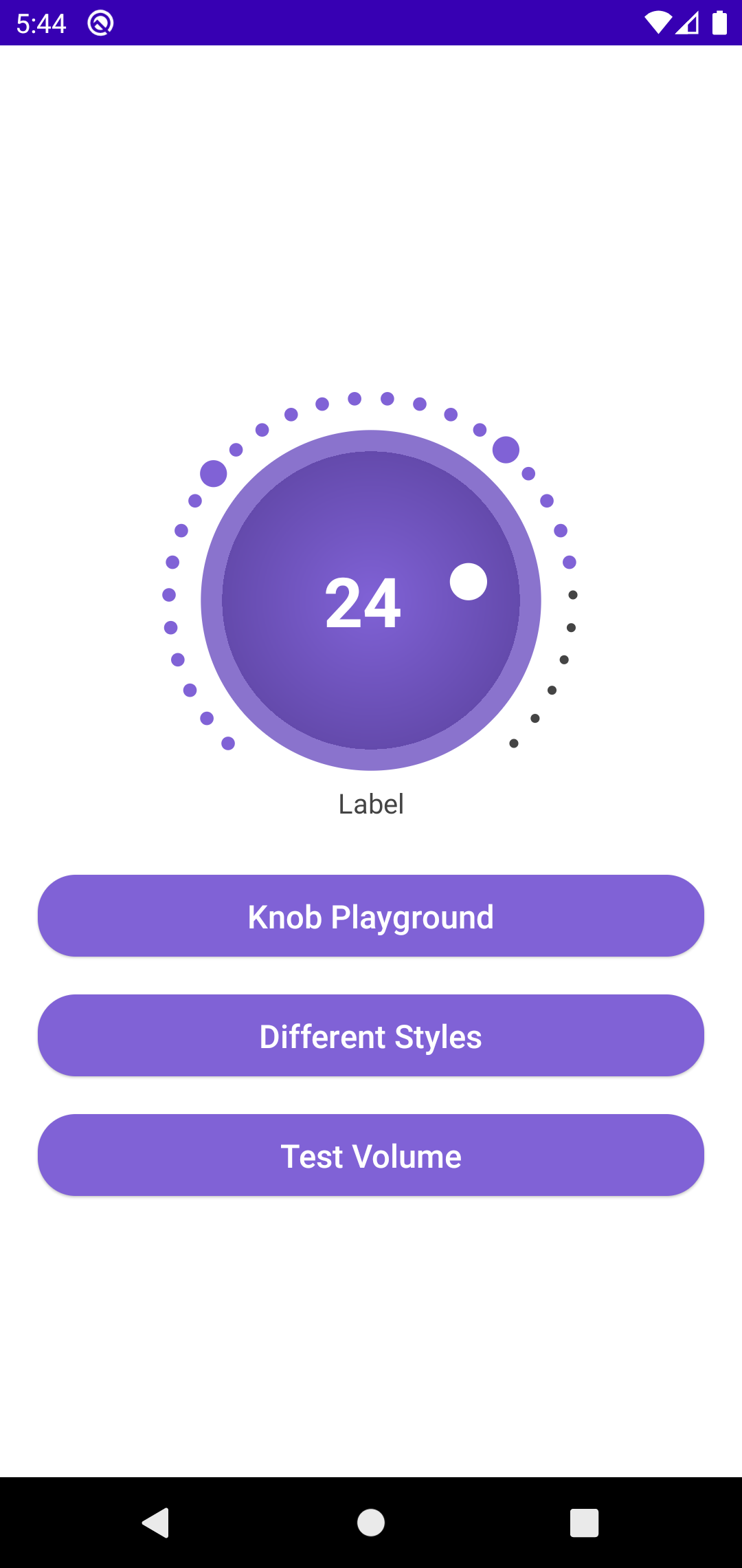 | 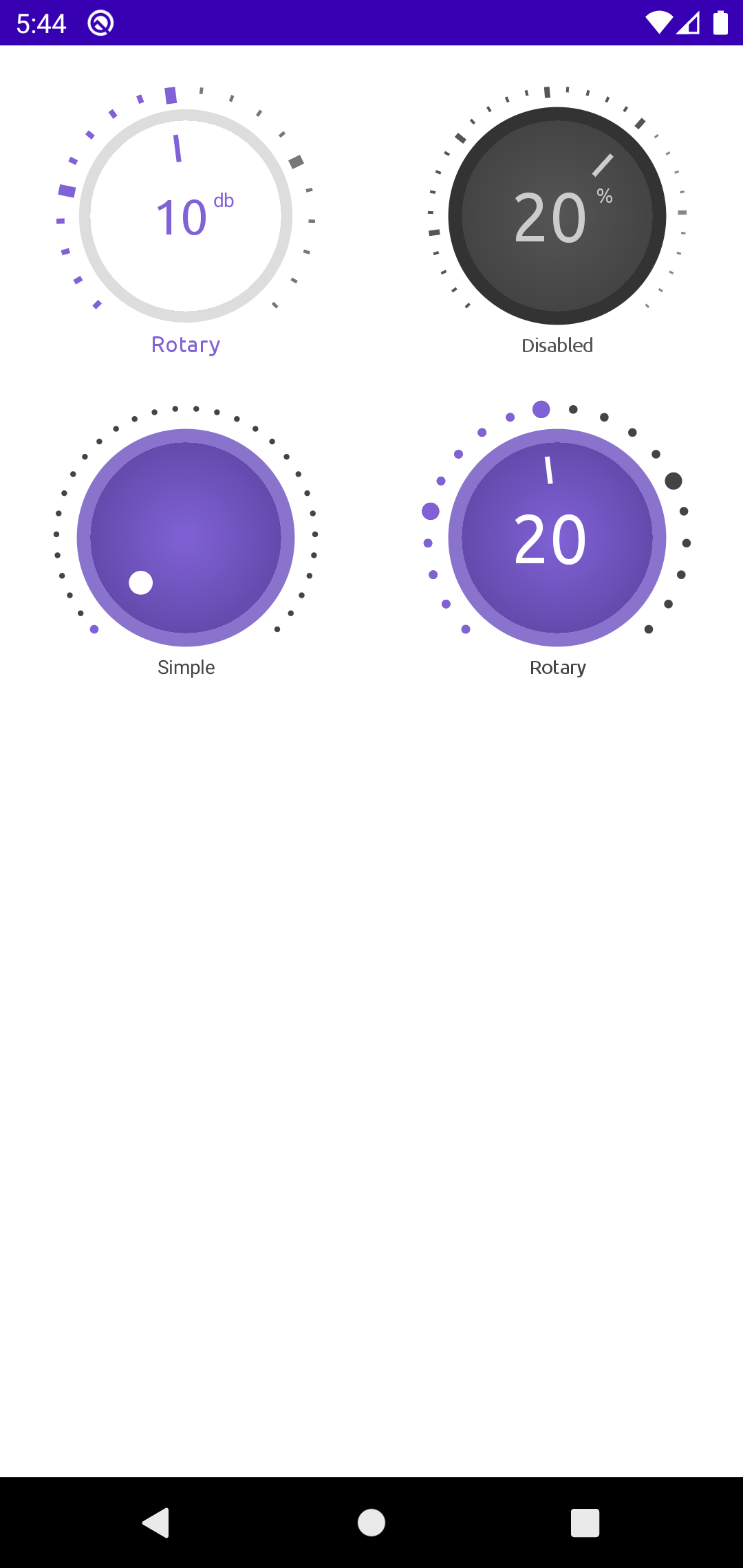 | 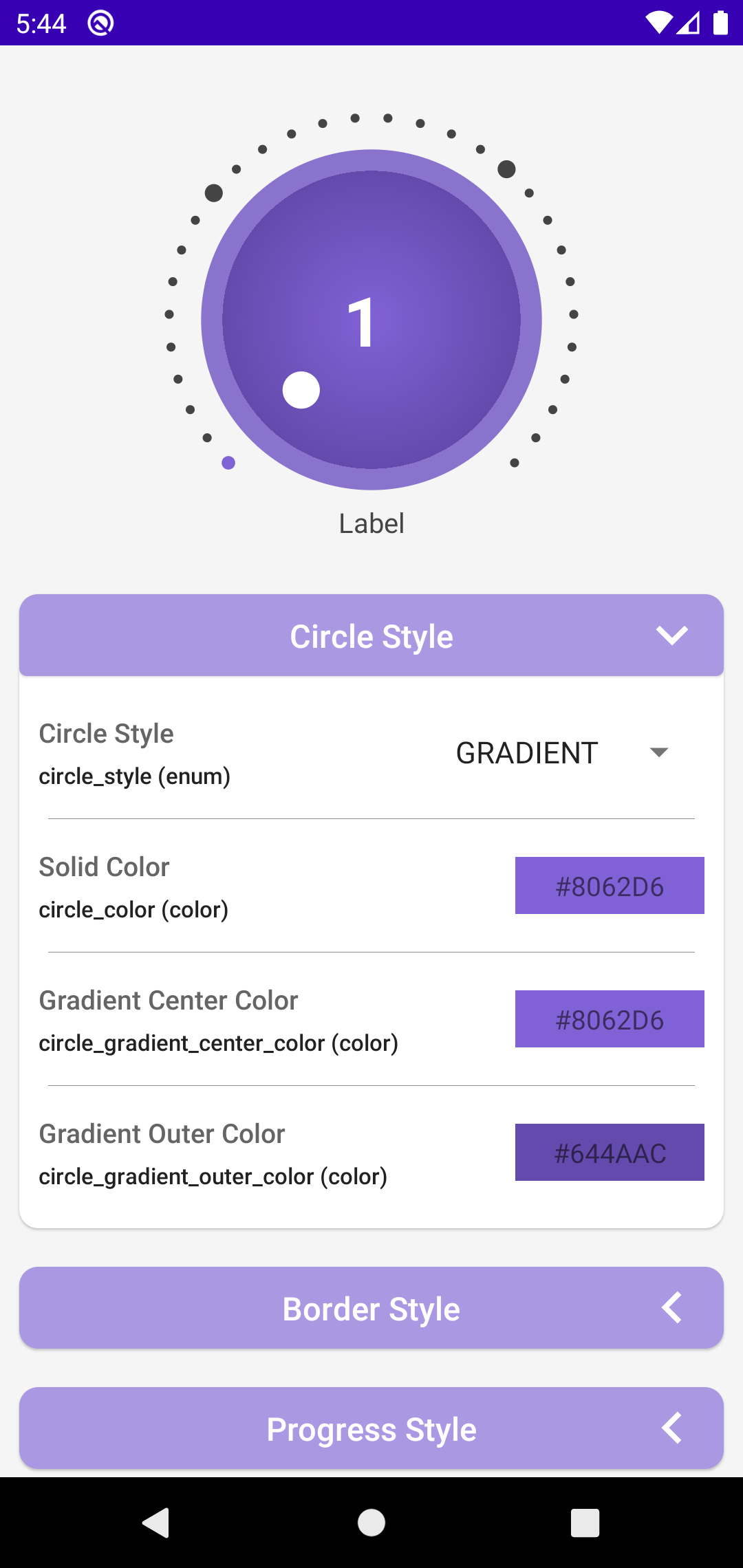 |
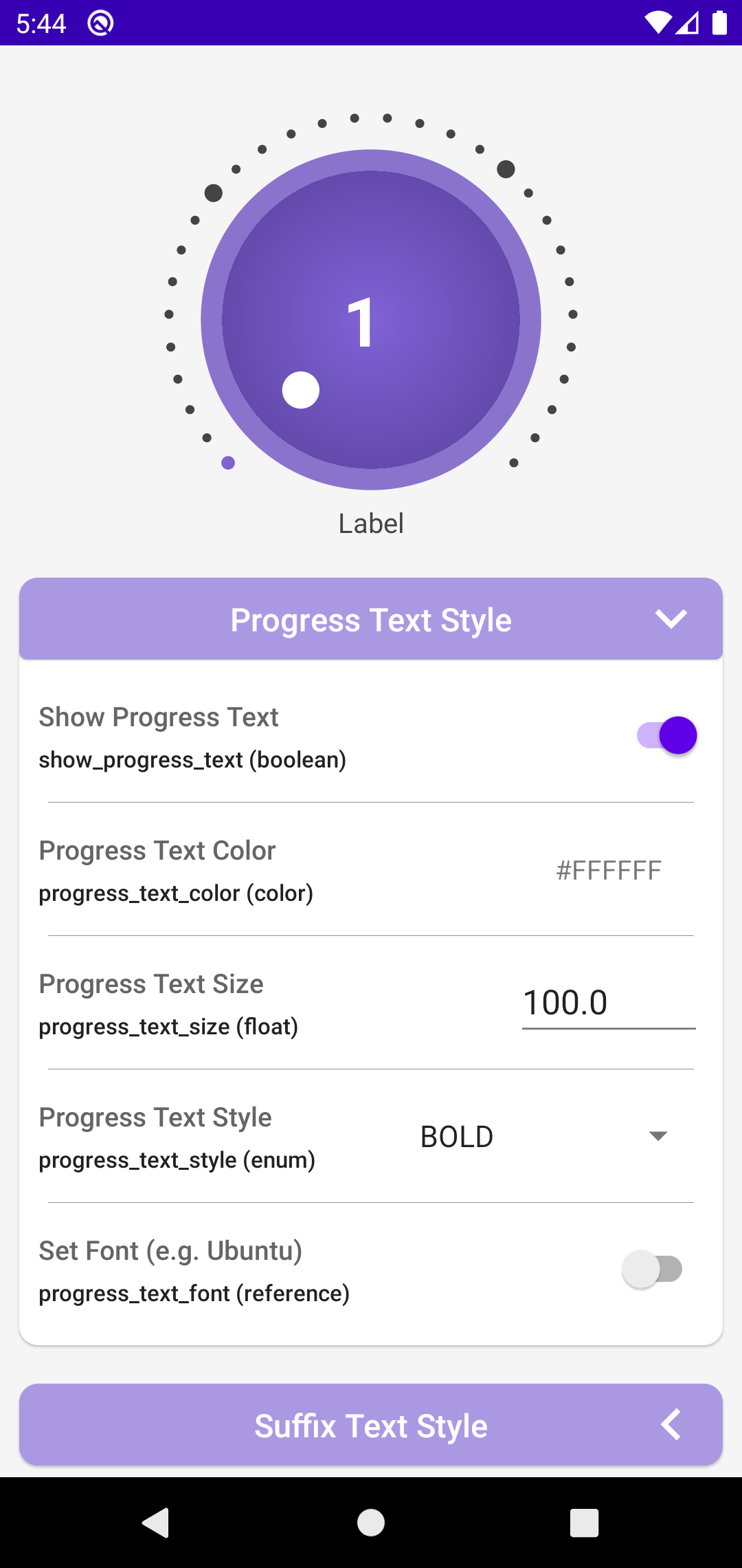 | 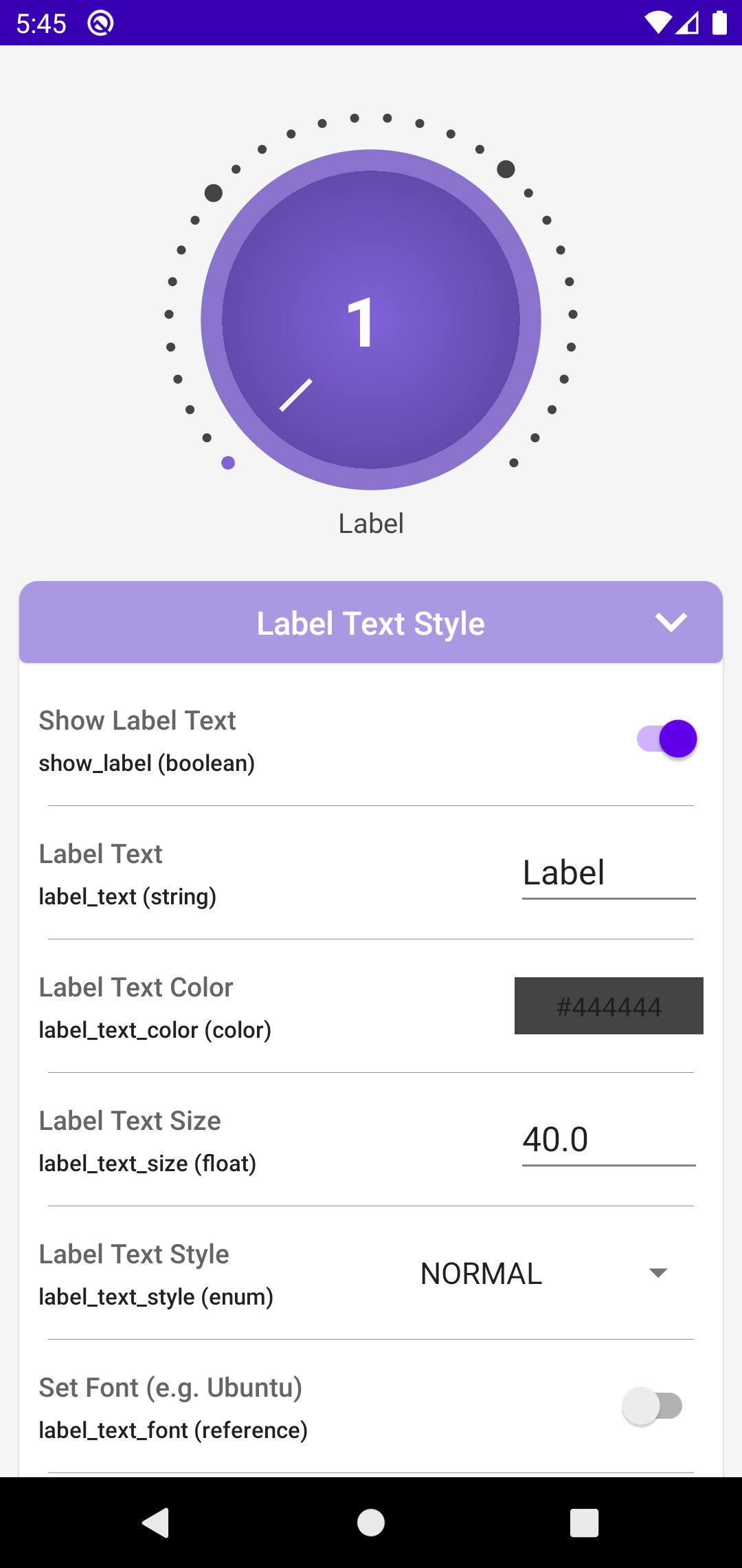 | 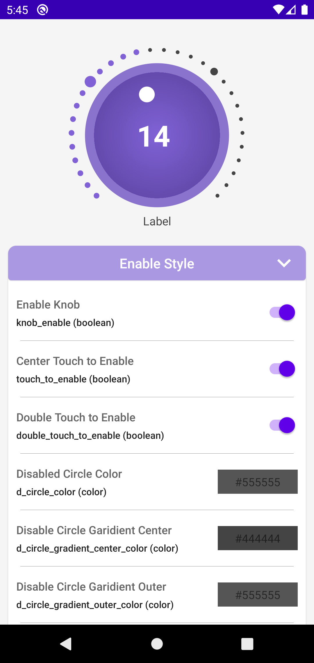 |
Technologies Used
This library is entirely coded in Kotlin, with additional assistance from XML for attribute creation. Android Studio serves as the primary Integrated Development Environment (IDE) for development.
The source code is proudly hosted on GitHub.
Workflow
Planning: I began by researching various images of Volume Knobs online to gather inspiration for the design. After reviewing around 10-20 different styles, I formulated a plan. However, I soon realized that my initial plan needed adjustments, prompting me to refine it further.
Draft UI: Using Figma, I created multiple design concepts for the Rotary Knob. After careful consideration, I selected two distinct styles—one featuring circles and the other lines—as the primary visual representations.
Core Coding: The development process commenced with the core coding phase using Kotlin. Starting from the foundational structure, I progressively implemented the functionality, iteratively refining and expanding upon it to shape the Rotary Knob into its final form.
Finalizing: Once the core functionality was established, I focused on fine-tuning the library. This involved dedicating time to incorporate additional tweaks and enhancements, ensuring optimal performance and usability before finalizing the project.
Problem and Solution
Canvas Angle Dilemma
Problem: Canvas drawing poses challenges with angles, particularly concerning the progression of the circle. Initially smooth, issues arose when implementing progress step drawing. The draw angle commenced anti-clockwise, contrary to the required clockwise direction. Furthermore, touch events presented angles in a convoluted manner, using both positive and negative degrees, exacerbating the complexity.
Solution: To address these challenges, I devised several adjustments. Firstly, I modified the angle obtained from OnTouchEvent by 90 degrees and added 360 if it was negative. This rectified discrepancies in angle representation. Secondly, I tackled the anti-clockwise drawing dilemma by subtracting from 360 degrees. Despite complexities arising from offsets in both start and end points, persistent experimentation and self-learning led to viable solutions. The scarcity of online resources for Canvas Draw necessitated a reliance on hands-on experimentation and personal learning.
How to Use
First you need to add the dependency in your build.gradle or build.gradle.kts and then just add the XML and Kotlin code.
Dependency
dependencies {
    ...
    implementation("com.github.ahmmedrejowan:RotaryKnob:0.1")
}
XML
    <com.rejowan.rotaryknob.RotaryKnob
        android:id="@+id/rotaryKnob"
        android:layout_width="match_parent"
        android:layout_height="250dp"
        android:layout_marginTop="20dp" />
Kotlin
        // listener for knob enable/disable
        binding.rotaryKnob.knobEnableListener = object : RotaryKnob.OnKnobEnableListener {
            override fun onKnobEnableChanged(isEnable: Boolean, progress: Int) {

            }
        }

        // listener for knob progress change
        binding.rotaryKnob.progressChangeListener = object : RotaryKnob.OnProgressChangeListener {
            override fun onProgressChanged(progress: Int) {

            }
        }

        // set knob min, max and current progress
        binding.rotaryKnob.currentProgress = 50
        binding.rotaryKnob.min = 0
        binding.rotaryKnob.max = 100
You can find the whole documentation here - https://github.com/ahmmedrejowan/RotaryKnob
What I've Learned
- Making this project required me to refresh my math knowledge. Even though it was tough, it helped me get better at creating custom views.
- I gained a lot of experience by creating a custom library with complicated features and designs. This taught me a lot about how to make libraries from scratch.
- When you really need something, you find new and creative ways to make it happen. This project challenged me to think outside the box, and that mindset will be useful for future projects.
Source Code
The source code and the whole project is available on GitHub.
Repository Link - https://github.com/ahmmedrejowan/RotaryKnob
Repo Page - https://rejowan.com/RotaryKnob/
Conclusion
In conclusion, working on this project taught me a lot. I improved my math skills and learned how to create custom views. Developing the library was a big experience, but it helped me understand complex functions better. I also realized that when you really need something, you find new ways to make it work. Overall, this project was a valuable learning experience that will help me in future projects.
